Brand & Experience Systems Advisory for SpringHill Resort, Sikkim
The Intent
The project began before identity design—with naming.
Situated atop a hill in Sikkim and defined by its own natural spring, the resort needed a name that could capture both its geography and atmosphere. The name SpringHill emerged as the convergence of these two defining elements—elevation and flow, stillness and movement.
The challenge extended beyond creating a luxury hospitality identity. The goal was to build a cohesive brand and experience system capable of:
- Translating the resort’s natural character into a recognisable visual language
- Creating emotional differentiation within the luxury hospitality space
- Establishing consistency across physical, digital, and environmental touchpoints
- Positioning the resort as an immersive nature-connected experience rather than accommodation alone
At its core, the project explored:
How can landscape, atmosphere, and sensory memory be transformed into a scalable hospitality identity system?
The Translation Framework
Defining the Foundational Narrative
The strategic foundation emerged from the resort’s strongest experiential assets:
- hilltop location
- natural spring water
- calm, immersive landscape
- slow, restorative atmosphere
This led to a guiding principle:
The identity should behave like the place itself—fluid, quiet, elevated, and restorative.
Building the Identity System
Rather than relying on decorative luxury tropes, the identity was designed around a singular visual behaviour: flow.
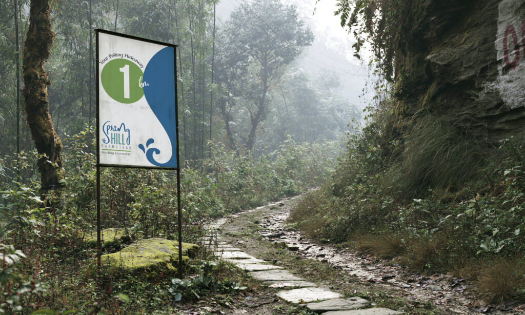
The selected logo direction introduced a fluid visual form where the letter ‘S‘ was designed to embody the movement of a flowing natural stream—capturing a sense of continuity, softness, and the quiet rhythm of water moving through the landscape.
In addition, the letter ‘n’ in SpringHill was subtly shaped to resemble a hilltop silhouette—embedding the resort’s elevated landscape directly into the wordmark itself.
To further reinforce the spatial character of the resort, the word “Hill” was designed using a long, narrow typographic structure. The vertical elegance and stretched proportions subtly evoke the feeling of elevation, horizon lines, and the elongated silhouette of hill ridges—bringing a sense of height, openness, and landscape directly into the wordmark.
Rather than using an existing typeface, the entire wordmark was custom-drawn specifically for the brand. Each letterform was carefully constructed to reflect the personality of the resort and maintain visual harmony with the core identity concept.
The placement of the word “FARMSTEAD” at the base of the logo was intentionally designed to function as a visual foundation—anchoring the fluidity and elevation of the upper wordmark. While “SpringHill” expresses movement, landscape, and atmosphere, “FARMSTEAD” introduces a sense of rootedness, stability, and connection to the land, reinforcing the resort’s relationship with nature, locality, and slow living.
Together, these elements transformed the logo from a static mark into a layered visual metaphor—capturing both the geography and emotional atmosphere of the resort.
This evolved into a strong visual mnemonic, becoming the core recognisable element of the brand system.
Developing the Visual Language
The selected Colour Palette – “The Calmly Hideaway” established the emotional tone of the brand.
Built around:
- Alpine Blue → horizon, sky, elevation
- Misty Teal → hill vegetation and water tones
The palette was designed to communicate:
- calm luxury
- nature-connectedness
- spatial openness
- emotional quietness

Systemising the Brand Across Touchpoints
The flowing “S” motif became the central connective element across the ecosystem:
- signage systems
- printed communication
- environmental graphics
- stationery
- digital interfaces
Rather than functioning as a logo alone, the motif evolved into a behavioural visual system—guiding movement, continuity, and recall across brand interactions.

Experience Translation
The engagement extended beyond identity into experiential direction:
- website design and development
- visual storytelling strategy
- art direction for photoshoots
The digital experience was designed to reflect the same qualities as the physical environment:
- spacious pacing
- visual calmness
- restrained luxury
- immersive atmosphere
Photography direction focused on:
- sensory stillness over staged hospitality
- texture, light, mist, and landscape
- emotional immersion rather than property documentation
The Impact & Experience Outcomes
Cohesive Hospitality Identity
A unified brand system spanning:
- logo and visual language
- environmental graphics
- digital presence
- guest-facing communication
Strong Visual Recall
The flowing ‘S‘ motif created an immediate and memorable association with:
- water
- movement
- landscape
- tranquility
Experience-Led Brand Positioning
The project shifted the perception of the resort from:
- accommodation → immersive retreat
- hospitality → emotional escape
Scalable Brand Ecosystem
The system enabled seamless expansion across the future:
- signage
- merchandise
- digital communication
- spatial experiences
Strategic Insights
This project demonstrates several transferable principles for hospitality and experience-led brands:
Place Can Become System
Strong identities emerge when branding is derived from the intrinsic behaviour of a location.
Visual Mnemonics Build Recall
Simple, behaviour-driven motifs create stronger long-term brand recognition than decorative complexity.
Hospitality Branding Must Extend Beyond Logos
Identity becomes more meaningful when integrated into spatial, digital, and sensory experiences.
Emotional Positioning Creates Differentiation
Luxury today is increasingly associated with atmosphere, calmness, and emotional immersion rather than visual excess.
Cohesive Systems Enable Scalability
A unified visual language allows hospitality brands to grow consistently across multiple guest touchpoints.
Advisory Perspective
This engagement reflects an approach focused on:
- translating environmental and emotional qualities into scalable identity systems
- aligning branding with spatial and sensory experience design
- building cohesive ecosystems across physical and digital touchpoints
- designing hospitality brands around perception and memory, not decoration
Closing Thought
The most memorable hospitality experiences are rarely defined by architecture alone.
They are remembered through atmosphere—
the way a place moves, sounds, breathes, and stays with us long after departure.
SpringHill’s identity was designed to carry that feeling forward:
quietly, fluidly, and with the same calm persistence as water moving through the hills.