Brand & Experience Systems for A Social Platform for Shared Memory
The Intent
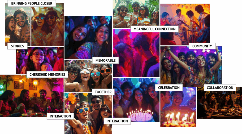
Memzy was envisioned as a new kind of social platform—one that moves away from passive scrolling toward active remembering.
The founding vision was clear:
to create a secure digital space where events are celebrated and remembered together.
The advisory challenge extended beyond branding into experience definition:
- How do we design a platform that feels like memory, not media?
- How can identity shape behaviour—not just recognition?
- How do we create emotional continuity across interface, interaction, and communication?
At a strategic level, the core question became:
How can a digital product transform fleeting moments into emotionally resonant, shared memory systems?
The Translation Framework
Decoding the Intangible
The process began by defining the foundational layer:
- Purpose, mission, and vision (co-created with founders)
- Emotional intent: connection, memory, shared presence
The insight:
Memory is not individual—it is relational.
The brand needed to reflect:
- warmth over utility
- presence over performance
- intimacy over broadcast
Abstracting the Core Logic
Instead of designing for features, the focus shifted to behavioural patterns of memory:
- Moments → captured fragments
- Memories → layered over time
- Sharing → collective experience
This led to a guiding principle:
Design for emotional recall, not content consumption.
Building the Identity System
Moodboard as Sensory Foundation
A moodboard was created not just as a visual reference, but as a diagnostic tool to sense the brand’s emotional pulse—aligned with Gen Z users with South East Asian
The Shape of the Name
“Memzy” — a hybrid of memory and emoji — required familiarity within unfamiliarity.
The solution:
- A typographic identity grounded in simplicity
- Focus on the letter ‘m’ as the emotional anchor

From Form to Meaning: Emergence of Me & Mo
The identity evolved into two core characters:
Me (pronunced as ‘Meh’), the keeper of memories — calm, observant, steady.
Mo (pronunced as ‘Mho’), the lover of moments — vibrant, playful, ever-curious.
Together, Me & Mo gave Memzy its language. They could smile in a notification, peek through a loading screen, or animate during an event — turning identity into interaction and the logo into a living form.
They function not as mascots, but as interaction agents—bringing emotional continuity across touchpoints.

Hybrid Creation Model (System + Emotion)
Color as Atmosphere
The Urban Neon palette was developed to reflect:
- digital vibrancy
- emotional warmth
- urban-global sensibility
Balancing:
- calming neutrals (Slate, Misty Blue)
- high-energy accents (Cyan, Magenta)

Logomark as Behaviour
The relationship between Me & Mo became a visual metaphor:
- framed within layered shapes (stacked memories)
- leaning into each other (shared moment)

Typography as Voice
Sniglet was selected for its:
- rounded, conversational tone
- natural rhythm aligned with spoken language
Lowercase usage reinforced:
- human connection
- informality
- accessibility

Experience Translation
The identity system extended into interaction design:
- Notifications and transitions feel alive, not mechanical
- Me & Mo appear across UI states
- Subtle gestures (blink, lean, nod) create micro-interactions

Ecosystem Development
The brand evolved into a multi-layered experience system:
- Logo → identity anchor
- Characters → emotional interface
- Color → environmental tone
- Motion → behavioural layer
This enabled:
- consistency across product, communication, and interaction
- scalability without loss of emotional integrity
The Impact & Experience Outcomes
Living Identity System
Memzy is not a static brand—it behaves, responds, and evolves across touchpoints.
Behaviour-Driven Design
The identity directly influences:
- how users perceive interactions
- how moments are shared and remembered
Emotional Differentiation
In a crowded social media landscape, Memzy shifts from:
- content consumption → memory creation
- interaction → connection
Strategic Insights
This project demonstrates a scalable framework applicable to digital products and platforms:
Design for Emotional Behaviour
User engagement deepens when design aligns with how people feel, not just what they do.
Identity as Interface
Brand elements can function as interaction systems, not just visual markers.
Characters as System Carriers
Well-defined personas can unify UX, communication, and motion into a cohesive experience.
Micro-Interactions Build Memory
Small, human-like behaviours create lasting emotional recall.
Systems Enable Scalability
A modular identity ensures consistency across expanding product ecosystems.
Advisory Perspective
This engagement reflects a consulting approach focused on:
- Translating abstract emotional intent into structured brand and experience systems
- Bridging identity, interaction, and behaviour design
- Enabling organisations to build emotionally intelligent digital products
- Designing for long-term engagement through memory, not immediacy
Closing Thought
Memzy was never just a brand.
It became a system that moves the way memory does—
quietly, relationally, and always in layers.
When design aligns with human behaviour,
it stops being interface—and starts becoming experience.